Area Chart: User Group Completion and Applications
Add to
Sign In
Use Your LeanIX Workspace
Click 'More' in the main navigation, then select 'Extension Hub'.
You will be signed in automatically.

Change Log
No version history available.
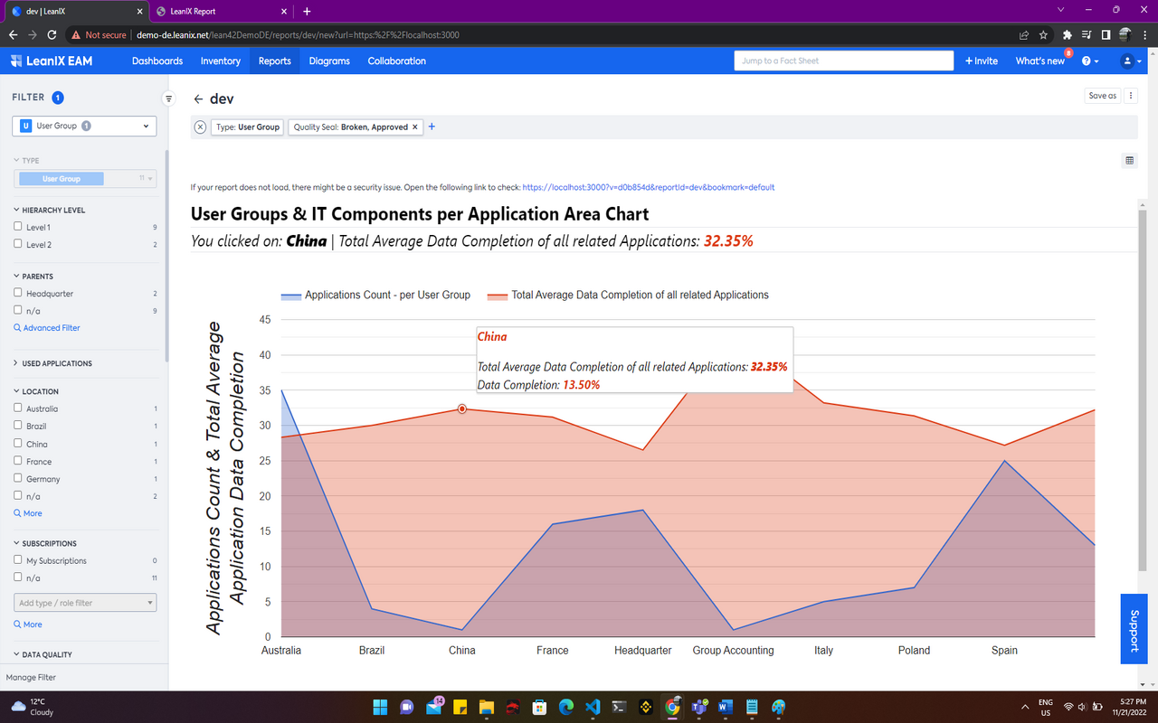
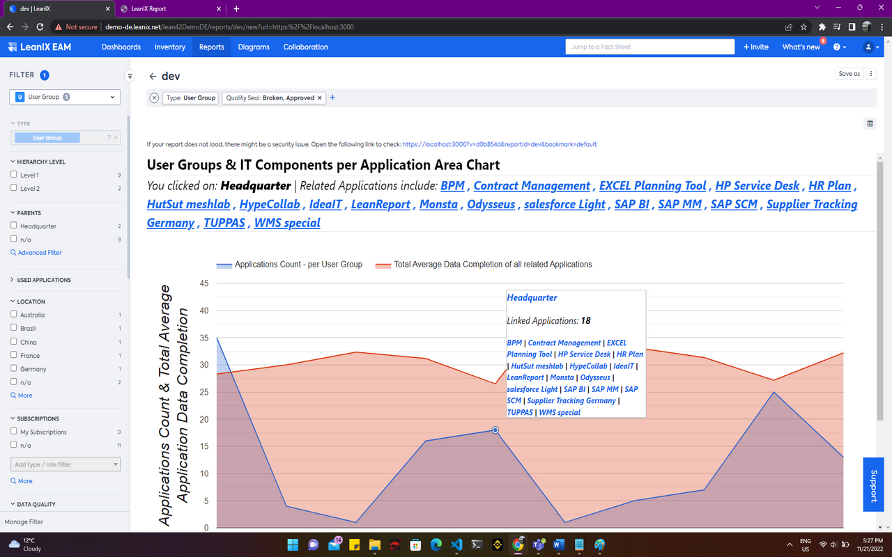
This Area Chart (using GoogleCharts) shows data completion of User Groups and Applications.
You can easily spot which business area has the most applications and how data completeness is for these applications. So you can focus your data completion on areas that have a poor completion.
The Area Chart makes use of quantitative data to represent connected dots and areas marked by a certain color. It makes use of an X and Y-Axes, where the Y-Axis makes use of two values, one for the count of Applications per User Group, and the other for total average data completion of all Applications per User Group. The chart allows for various User Group filters to be applied.
Details
The report is configured automatically and uses all standard filters for User Groups.
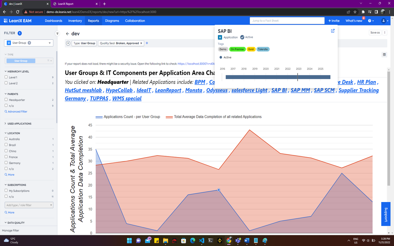
The chart allows for hovering and clicking on dots representative of user groups. Clicking on dots shows a section above the chart which refers to the user group being clicked along with its related applications. This list of applications can be used to navigate to the respective fact sheet information.
Configured data fields and specific tags are not required by this report. The Fact Sheets data of all User Groups is required along with relationship data to Applications.