Application Portfolio by User Groups and IT Components
Add to
Sign In
Use Your LeanIX Workspace
Click 'More' in the main navigation, then select 'Extension Hub'.
You will be signed in automatically.

Change Log
No version history available.
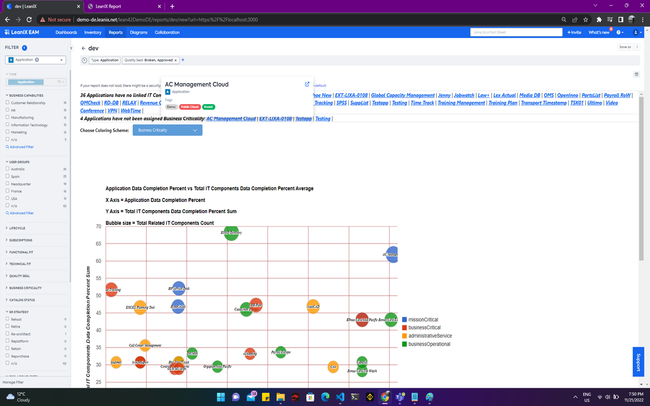
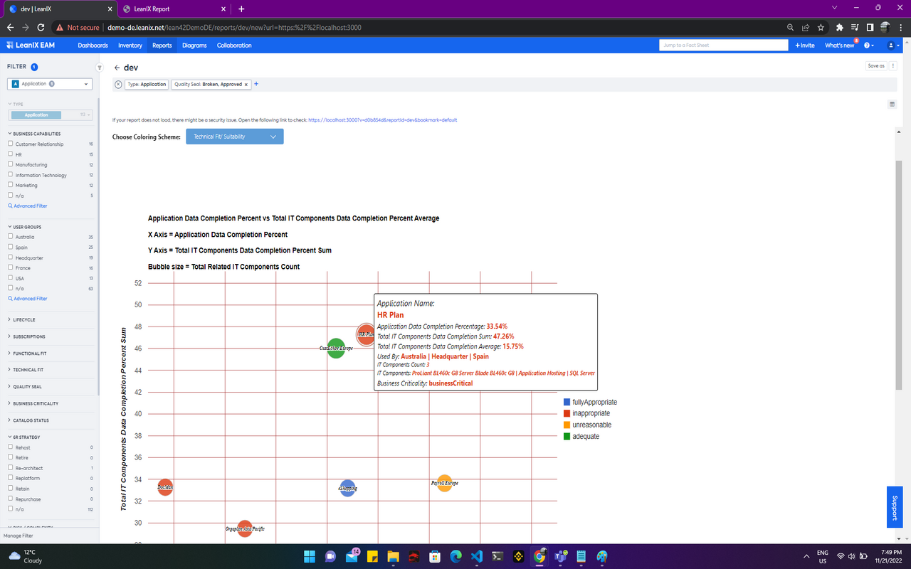
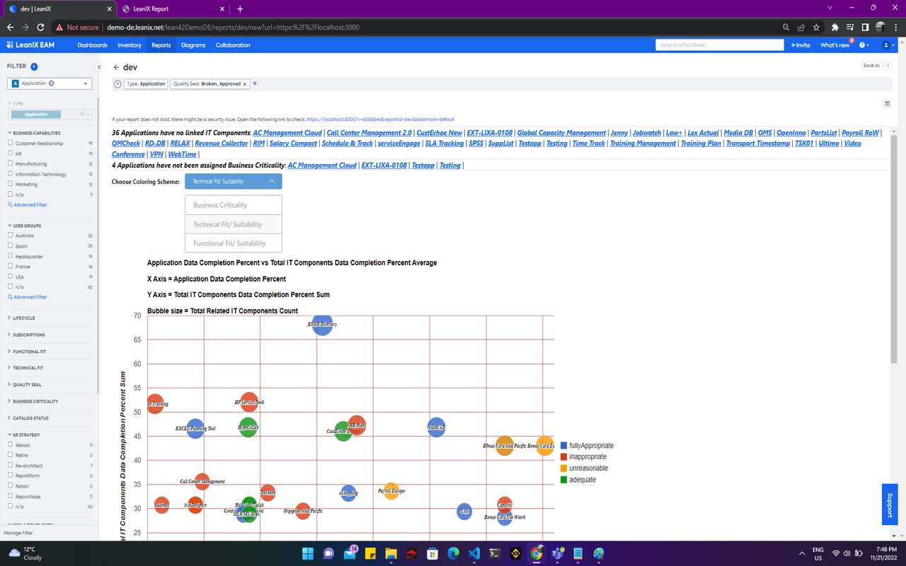
This report is a Bubble Chart or Portfolio Report (using Google Charts) which aims to represent each Application as a bubble, with it's size being based on the count of related IT Components and an adjustable color scheme for well distinguishable legends on the left side of the chart. The X-Axis of the chart makes use of each Application's Data Completion Percentage, while the Y-Axis, makes use of the Total IT Components Data Completion Sum Percent (per Application). The chart allows for zooming-in and out for a better view on applications that might be too close to each other or overlapping. The chart also makes use of
a tooltip that displays data such as name, data completion percentages (sums and averages), associated user groups, IT components, and assigned business criticality. You can also apply different attributes for color coding (three choices: business criticality, technical fit, functional fit).
Details
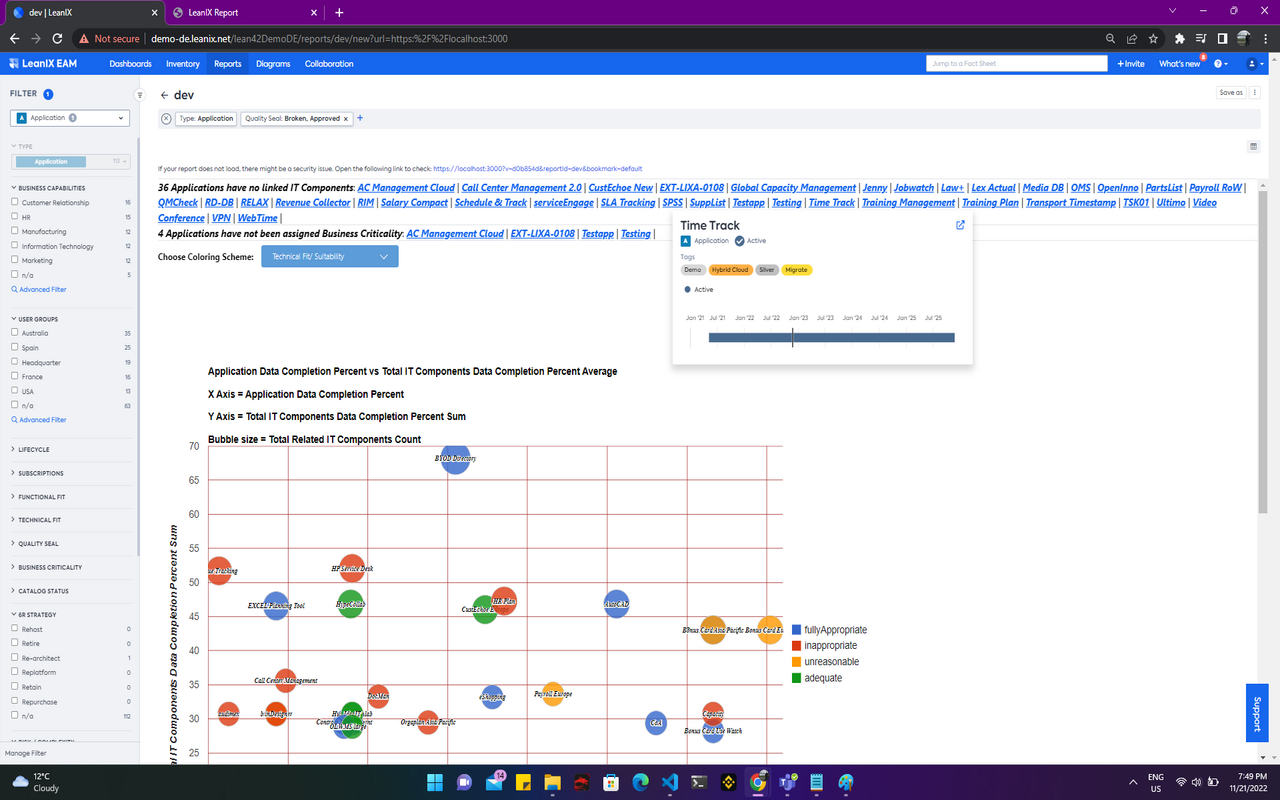
The report is configured automatically and has a fixed fact sheet type filter for Applications. Various Out of the Box Application related filters can be applied. Hover on each bubble to be presented with a tooltip containing respective application data. The dropdown above the chart allows for changing the attribute used for coloring. Underlined items above the chart can also be clicked for redirection to associated fact sheet.
No configured data fields are required for the report to work. No specific tags are required as well. Data related to Applications is required for the creation of this report - e.g. business criticality, technical fit & functional fit for coloring.